Clearer order updates. A simpler way to tip.

Clearer order updates. A simpler way to tip.

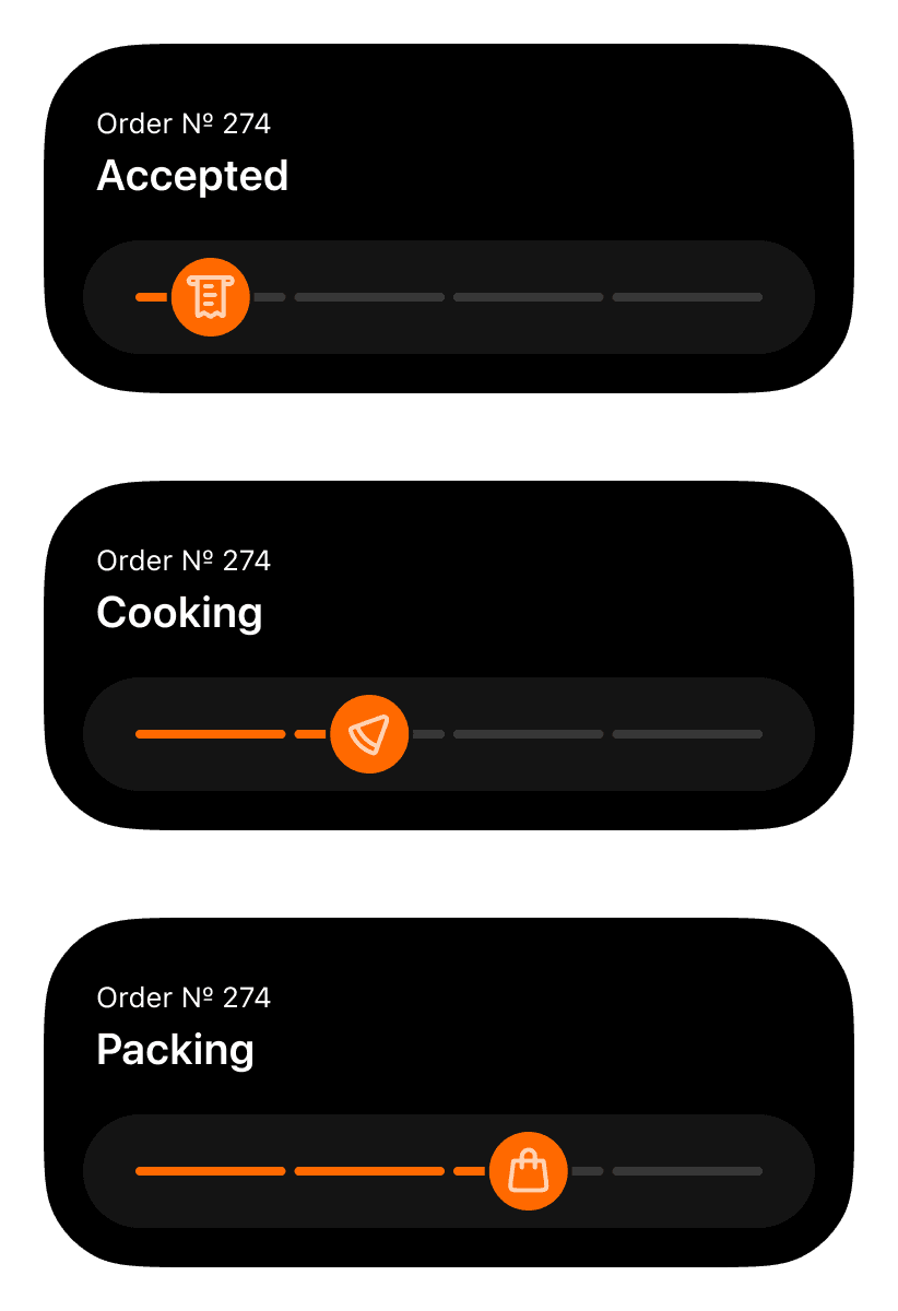
Dodo’s Live Activities had become crowded, and expanding to Apple Watch called for a clearer hierarchy. Updated widgets make order updates easier to scan, and rating and tipping easier to access.

Dodo’s Live Activities had become crowded, and expanding to Apple Watch called for a clearer hierarchy. Updated widgets make order updates easier to scan, and rating and tipping easier to access.

Use the arrow keys to adjust the comparison. Home shows only After; End shows only Before.

+26%

Total tips to couriers worldwide

+41%

Tipping conversion rate

6.4 → 8.1

Courier satisfaction score

before and after redesign · same product scope and markets · internal analytics

Essentials at a glance
Order status takes priority. The order number appears only when needed, leaving more room for what matters now.
Use the arrow keys to adjust the comparison. Home shows only After; End shows only Before.
When plans change
Clear updates for every delivery scenario: on time, running late, or without an estimated arrival time.
Use the arrow keys to adjust the comparison. Home shows only After; End shows only Before.

Progress you can read

Tested icons make each stage recognisable. The ring’s segments show how many steps remain.

Simpler finish

A focused post-delivery widget brings rating and tipping together, with fewer distractions.

Wrist-based updates

Order status and arrival time, adapted for a smaller screen and a quick glance.

A natural adaptation for RTL languages

A natural adaptation for RTL languages

I adapted Dodo’s app for right-to-left languages, from screen layouts to ratings and progress indicators. Figma modes brought those changes into the design system, reducing manual work on future updates.

I adapted Dodo’s app for right-to-left languages, from screen layouts to ratings and progress indicators. Figma modes brought those changes into the design system, reducing manual work on future updates.

Use the arrow keys to adjust the comparison. Home shows only RTL; End shows only LTR.

Ratings follow reading order

Stars fill from right to left, keeping the rating interaction aligned with the language.

Layout changes. Meaning stays.

Icons and controls swap sides to follow the layout. Prices and symbols retain their orientation.

Switch modes. Skip rework.

Figma modes apply directional changes across components, reducing the need to rebuild each screen manually.

Packaging rules. Clearly handled.

Packaging rules. Clearly handled.

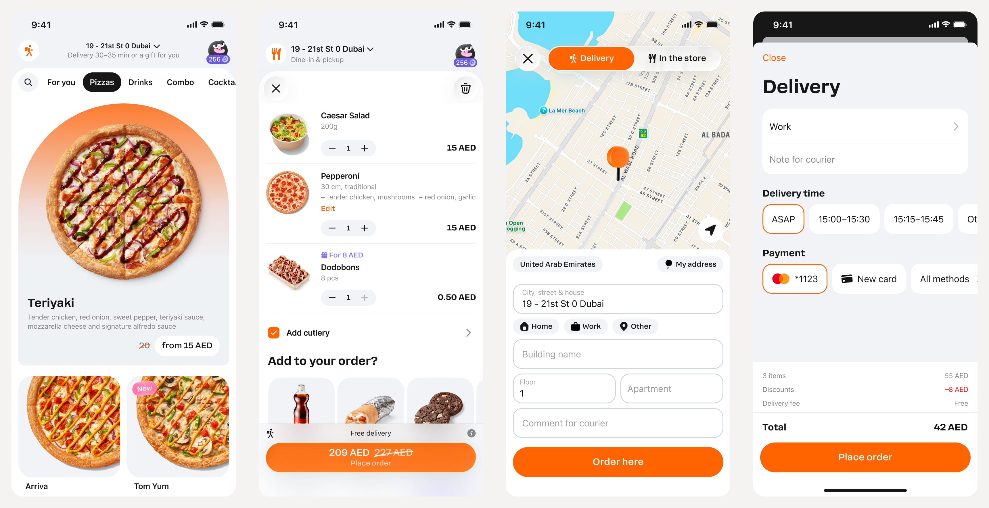
I adapted the existing ingredient-selection pattern to handle required packaging, optional extras, and bottle deposits. The solution works across the app, web, and kiosk, making choices and costs clear from product selection to checkout.

I adapted the existing ingredient-selection pattern to handle required packaging, optional extras, and bottle deposits. The solution works across the app, web, and kiosk, making choices and costs clear from product selection to checkout.

Familiar controls, different rules

Required packaging stays included. Optional items can be removed using the same familiar controls as ingredients, with the price updating accordingly.

Different ways to pick up

Takeaway, tray service, and table service have different packaging needs. The ordering flow accounts for each and shows the takeaway packaging fee alongside the choice.

Every charge accounted for

Packaging fees and deposits are itemised within the order and reflected in the total, including deposits already built into product prices.

One app. A local story for every market.

One app. A local story for every market.

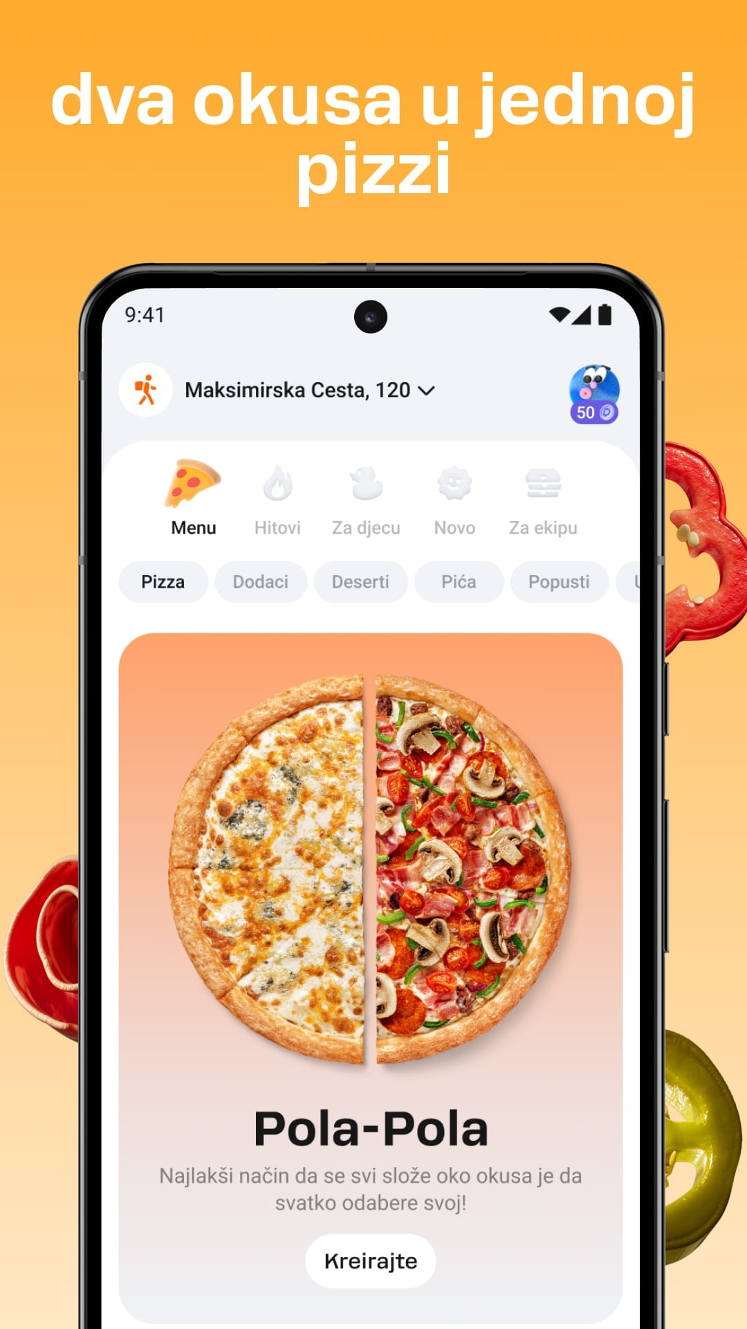
I designed App Store screenshots with a 3D designer, keeping a consistent visual style across languages and markets. Working closely with local market managers, I made sure each screenshot featured relevant products, offers, and messaging for its audience.

I designed App Store screenshots with a 3D designer, keeping a consistent visual style across languages and markets. Working closely with local market managers, I made sure each screenshot featured relevant products, offers, and messaging for its audience.