

Product
Mobile and desktop web ordering platform
Scale
5 million active monthly users across 27 markets
Role
End-to-end product design, research, prototyping, experimentation, and QA
Team
Product Manager, Researcher,
1 back-end, 3 front-end devs
Constraints
Fragmented experience
Web shared a backend with the app, but not its design system or capabilities. Outdated patterns and legacy content made ordering slower to scan and harder to evolve.
Limited capacity
The app received most product investment. Web improvements had to be high-impact, technically contained and safe to release across 27 markets.

Problem
Customers struggled to distinguish products. Testing showed that lengthy descriptions did little to help them choose, while promotions sat outside the main browsing flow.
Decisions
Removed low-value descriptions, brought offers into the browsing flow, and gave priority products more visual weight.
Trade-off
Less descriptive content made products faster to compare, but required stronger imagery and clearer naming.
+139%
Offer usage
After moving promotions to the home page
+68%
Hero card conversion
Compared to the previous design
+43%
App installs
Attributed to the web banners
+22%
Order conversion
9.8% → 12% increase across top 10 markets
3 months before vs 3 months after launch · Top 10 markets · Internal product analytics
Problem
Customers struggled to confirm delivery availability. The flow asked for too much information and gave too little guidance when an address could not be served.
Decisions
Simplified address entry and map selection, and made delivery availability clear before customers continued.
Trade-off
Precise location data was still necessary. I kept validation, delayed secondary details, and made errors easier to correct.
–34%
Location-related order cancellations
+18%
Completed orders conversion rate
+€480k
Additional monthly revenue estimated from the conversion uplift
8 weeks before vs 8 weeks after launch · 8 test markets · Internal order analytics
Problem
Phone was the only support channel. It interrupted ordering and made simple issues expensive to resolve.
Decisions
Designed in-product support around an existing chat SDK, trading customisation for a faster rollout.
16% → 64%
1-month retention among the users contacting support
Six-figure
Monthly support-cost savings
Post-launch results across 18 markets · Internal product analytics
Problem
For many customers, web is their first encounter with Dodo. The existing card underused product photography and presented the experience as a configuration form rather than a branded product moment.
Decisions
Made photography dominant, grouped size and crust choices, and presented add-ons visually. Standard products remain one-click; configuration appears only when a product requires it.
Constraint
The richer presentation could not add friction to routine ordering or depend on every product having configuration options.


Problem
The cart interaction already worked well, but its styling, hierarchy and components no longer matched the redesigned ordering experience.
Decisions
Preserved the familiar side-panel behaviour while updating typography, spacing, item presentation, totals and the checkout action.
Constraint
The redesign had to improve consistency without changing established behaviour or introducing unnecessary relearning.

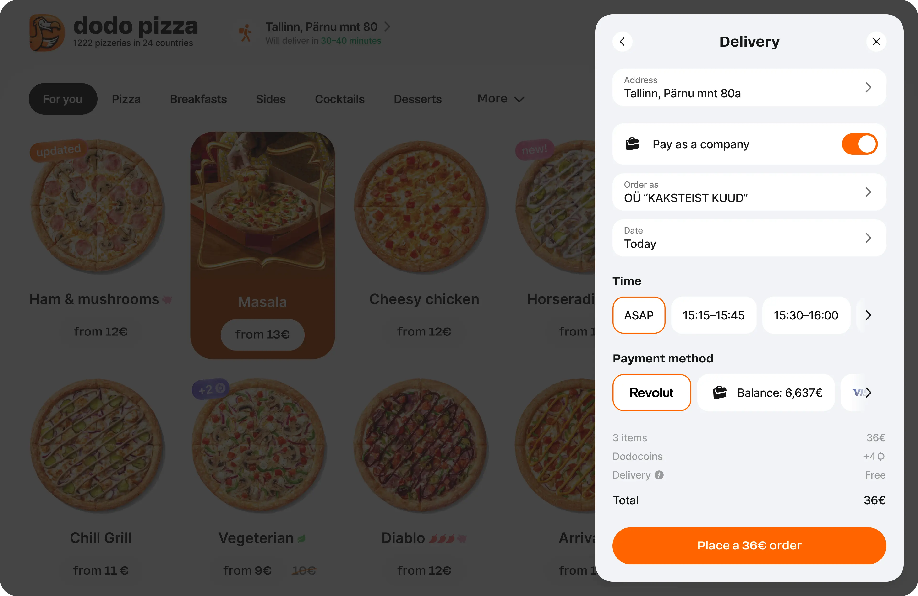
Problem
Checkout felt disconnected from the menu and gave weak feedback after submission.
Decisions
Kept checkout in the same spatial layer, made progress explicit and preserved the order summary through confirmation.
Constraint
Preserving context reduces space for forms, so each step should request only the information it requires.
