Product
Corporate, franchise and live-sales website
Scale
2 brands across 28 markets
Role
End-to-end product design, prototyping, information architecture, content requirements
Team
C-Level stakeholders,
1 back-end, 2 front-end devs
From the group overview to store performance
Evidence
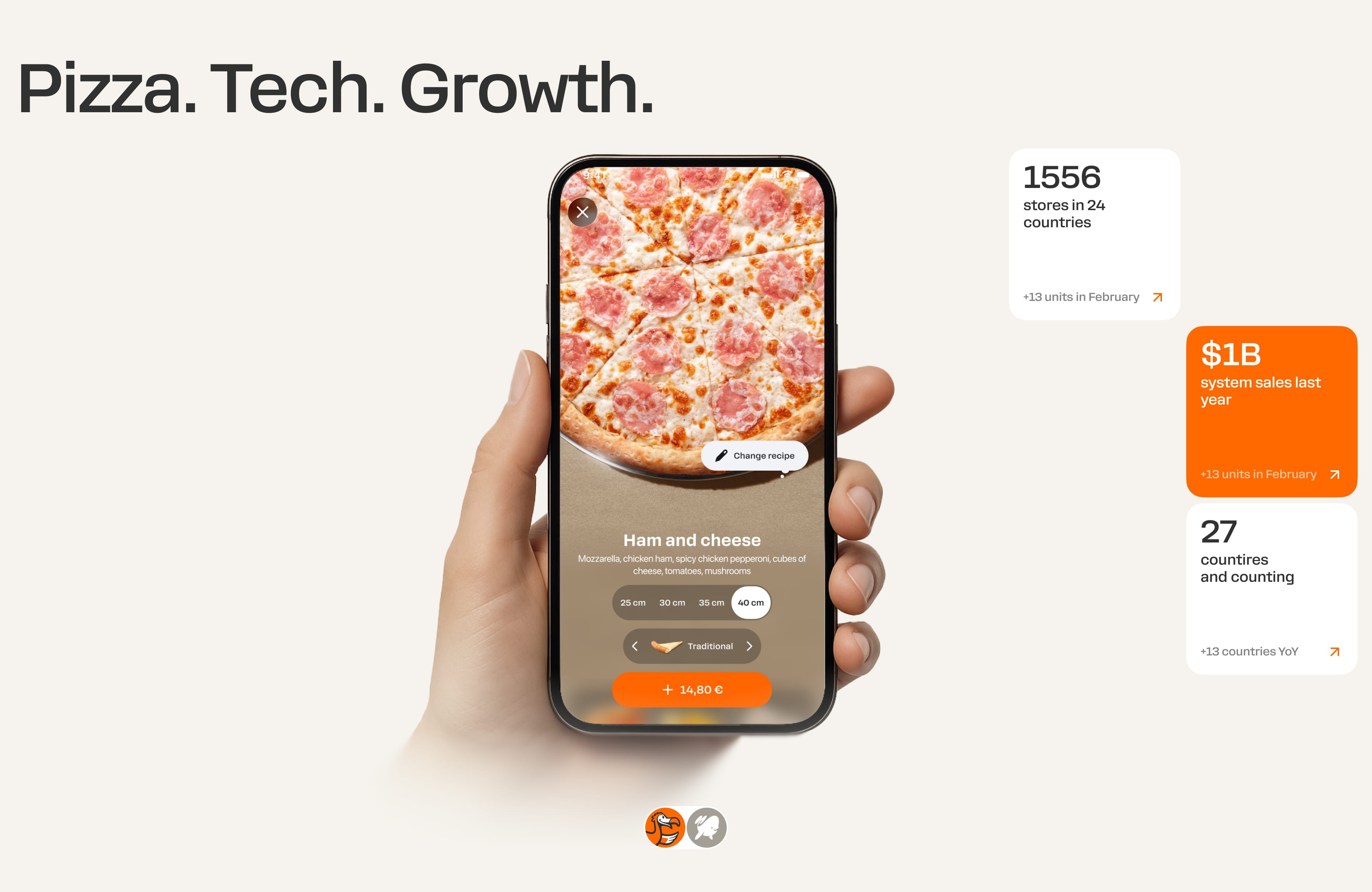
Visitors needed to understand the group, evaluate individual franchise propositions and inspect actual store performance. Each task required a different level of detail.
Decision
Connected the group overview, brand propositions and live sales data, giving visitors clear routes from exploration to enquiry.
Trade-off
Kept brand and sales journeys distinct, with shared navigation so visitors could move between them without losing context.

Evidence
Both brands needed to communicate comparable franchise information, but their products, identities and emotional propositions were different.
Decision
Shared the page structure and interactions; used colour, photography and expressive details to give each brand its own voice.
Trade-off
Standardised comparable franchise information while leaving room for each brand’s identity.

Evidence
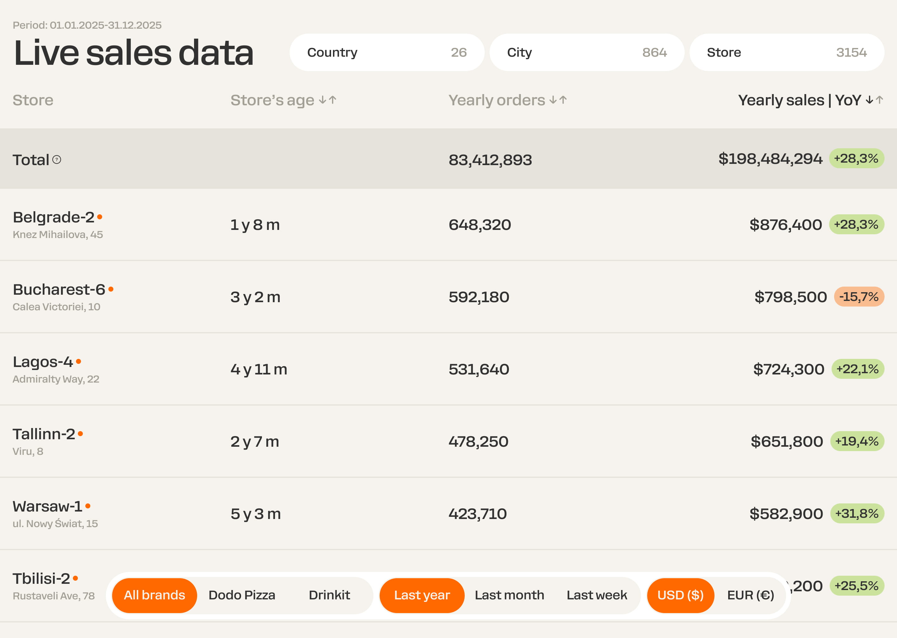
The initial direction reflected leadership’s preference for showing comprehensive detail. Testing with active franchisees showed that this made the key performance information difficult to find. Their feedback helped us decide what to keep in the overview and what to move into store details.
Process
Tested 4 working prototypes with 18 active franchisees to identify essential metrics and confusing controls.
Decision
Kept the most-used comparison metrics in the overview, moved secondary data into store details, and let users narrow the list by country, town, and store.
Resulting experience
In later rounds, franchisees described the overview as clearer and easier to use. We refined the information hierarchy through several rounds of validation before shipping the final version.
Comparison first
Kept only the information needed to compare store performance.
Detail on demand
Moved secondary metrics into the individual store view.
Clear active context
Preserved the selected brand, market, reporting period and currency while users narrowed the dataset.
Responsive prioritisation
On smaller screens, users compare stores through one selected metric rather than a compressed desktop table.
